
12 Square Living Room Layouts
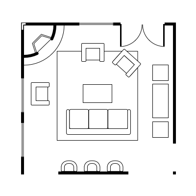
One of the hardest things to figure out when you move into a new space, is how should I layout the furniture? Roomhints has come up with 12 unique layout hints for your square living room with a corner fireplace.
Furnishing or redesigning your living room is fun: The feeling of success when you find the perfect coffee table, discovering an amazing color scheme and finally, that moment when you sit back on your couch and gaze over your newly designed living room. You did it.
But it is also a whole lot of work, especially if you have a room with very particular requirements. Every room will have some things that are hard to change, for example, the location of doors and windows. Some are even more challenging, though and will constrain you in your choices.
But no need to despair – every room can be conquered! Today, we’re tackling a very special kind of room.
Our Room
To start with, here are some details about the living room beast we’re dealing with today:
- Our room is 20 foot square with a fireplace in the corner (our first challenge!)
- At the bottom of the room, you can see a kitchen bar and stools, which connect to the kitchen.
- There are French doors at the top and three more entrances into the room, from the kitchen on the left, and the hallway and bedroom on the right.
- Of course, there are windows too – a lot of them! They cover two sides, which does not leave us much wall space to put furniture against.
Here are our 12 different layout ideas for this space:
1. The All-Rounder
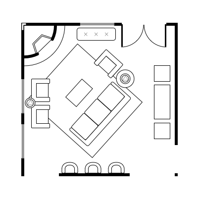
The centerpiece of this living room is the sofa in the middle of the room, facing the fireplace. Three upholstered chairs are grouped around it. A big, cozy carpet ties all of these furniture elements together. This layout allows gatherings of small groups as well as more intimate conversations.
We also added lights: There’s a lamp on a little table next to the sofa and a floor lamp between the two chairs in front of the window. Having a variety of lighting sources lets you create a warm and intimate atmosphere in your living room.
Have you noticed the bench next to the French doors? It provides extra seating in case you’re hosting a bigger group. And as it does not have any arms, it looks less bulky than a proper sofa. It’s a great way to add extra seating while not taking up too much space.
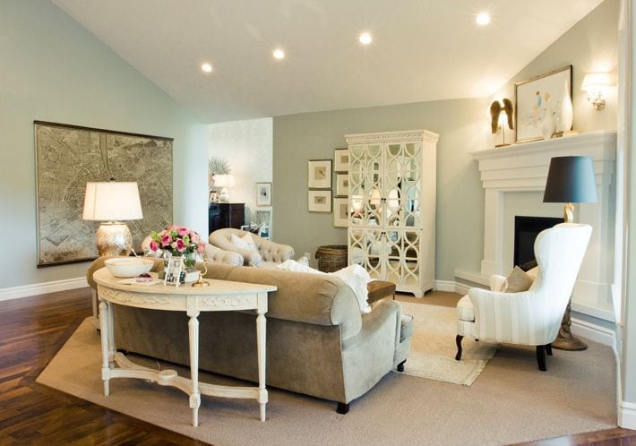
(image from Brooklyn Berry Designs)
2. The Space to Move Around
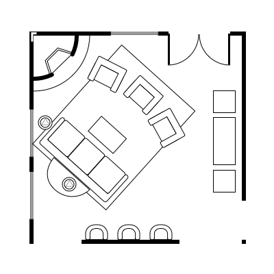
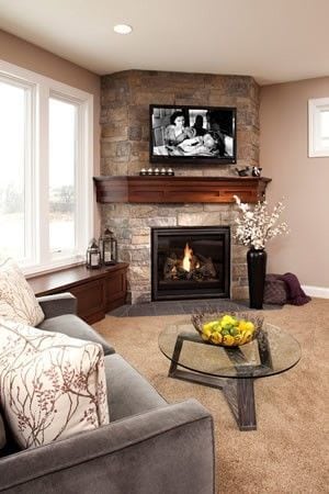
Here, we also have a sofa and three sofa chairs, but we rearranged their placing in the room. The chairs are directly opposite the sofa and provide a nice counterbalance. As the sofa goes diagonally into the room, it has created an awkward, triangle-shaped, empty space between the sofa and the wall. We have solved this by filling the space with a table and a lamp at the back of the sofa.
You might wonder whether the right bottom corner looks a bit empty. But that’s on purpose: there are 2 entrances coming in from this corner, which means that people will move around a lot in this corner.
(image from Pinterest)
3. The Coffee Table Center Point

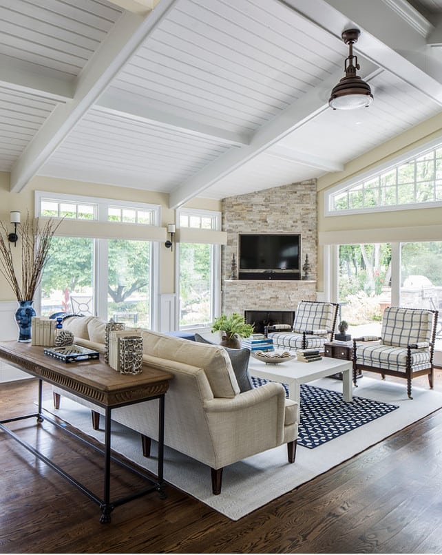
If you don’t like arranging your furniture diagonally in a room, this layout idea might be better for your living room. We arranged the sofa and sofa chairs around a center point right in the middle of the room, the coffee table.
Want some extra lighting? You could place lamps between the two chairs at the top, or next to the single chair at the left.
(image from Home Bunch)
4. The one That’s all About the Crackling Fire
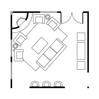
This living room layout is a take on the very first one. As before, the sofa is facing the fireplace. Instead of a bench, we have added another sofa chair. Remember, the chairs don’t have to be all the same! You can mix them up, as long as they fit your general style.
We now have two small groupings of two chairs, with a floor lamp in between each. This living room layout provides a range of conversation zones: You can have very private ones on the sofa chairs, for when your best friend tells you about her latest amorous adventures. At the same time, you can still entertain bigger groups.
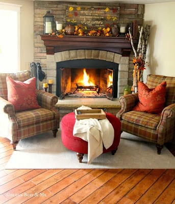
Also, did you notice how well the fireplace is integrated into this arrangement? After all, this living room layout is all about gathering around a crackling fire!
(image from Golden Boys & Me)
5. The one With a Passage
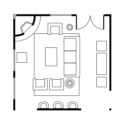
In this room, we have a large sofa facing the windows and fireplace on the left side. The sofa is in the middle of the room and naturally creates a passageway from two of the entrances (in our case, from the front hall and bedroom) to the French doors. Three upholstered chairs have been placed next to the sofa and a coffee table acts as the center point.
With a side chair placed against the left-side window, we’ve added another flexible seating option. This chair could match the two chairs on the right side of the room. If it is the same color or pattern you create continuity in your style and bring the whole room together.
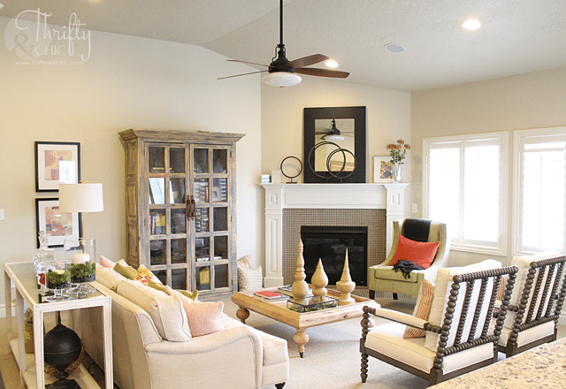
(image from Thrifty and Chic)
6. The one for the Perfect Couches
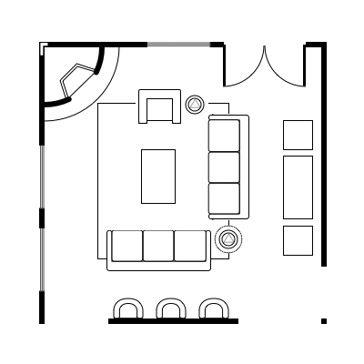
This layout is a take on number 5. The only significant change is that we replaced the two upholstered chairs with another 3-seater sofa. If your family loves to stretch out, you might want to opt for more sofas rather than chairs. That way, you don’t have to fight about who gets to nap first!
In terms of lighting, this layout features a floor lamp next to the side chair and one end tables with lamps on either side of the sofa. You could also replace these with more floor lamps – whatever fits your style!
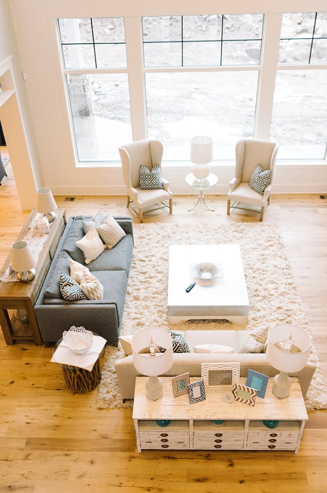
(image from Home Bunch)
7. The Simple but Classic
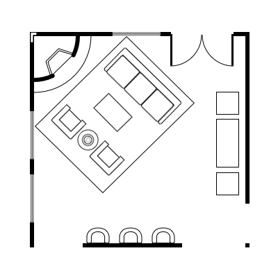
Here, the sofa and chairs are placed on an angle, opposite each other. Even though they’re not facing the fireplace, it still serves as our focal point. Notice how the carpet leads towards it? People would – especially if they come in through the entrances on the right – be naturally drawn towards the fireplace. The carpet and the diagonal arrangement also connect the fireplace to its counterbalancing piece, the chest on the right-hand side. You see, it’s all about balance. Your layout should make sense and convey harmony to you without having to think about it.
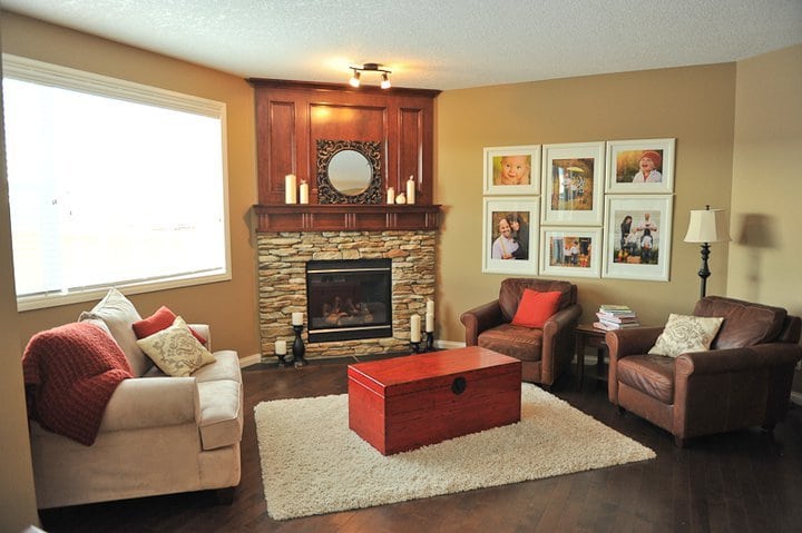
(image from Brooklyn Berry Designs)
8. The Simple but Classic With a Twist
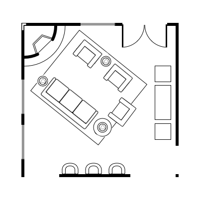
This layout idea is similar to the last one. We have switched the sofa and the two chairs around, and added another chair on the right side of the arrangement. There are several lighting sources to give you options on how to illuminate your room. If you’re watching a TV show, you might only want to have one side lamp on. If you’re having a ladies night with your best friends, you might want to turn all of them on to create a soft and warm atmosphere. And don’t forget to make use of your fireplace! Nothing gets as cozy as that…
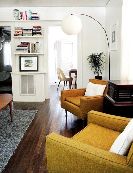
(image from Pinterest)
9. The Playful Balance
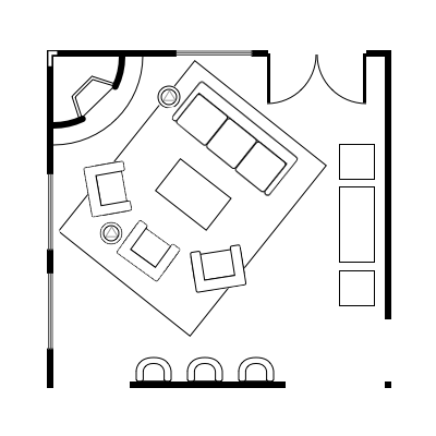
Remember number 2 of our layout ideas for your square living room? If yes, then this one might feel familiar to you. On the upper end of our seating arrangement, we have a 3-seater blue sofa with a floor lamp on its left side. Opposite the couch, there are three sofa chairs and another floor lamp – these provide perfect counter-weight to the couch and the lamp next to it. This room is very balanced but not boring: The placement of the pieces – on an angle, almost scattered around the room – creates a bit of suspense.
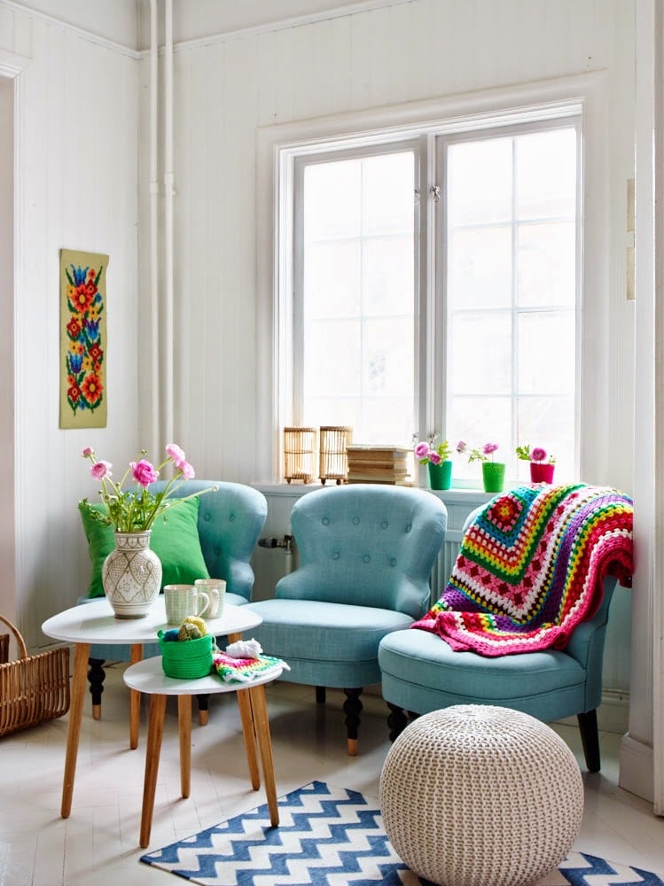
(image from Sanna & Sania)
10. The Conversation Creator
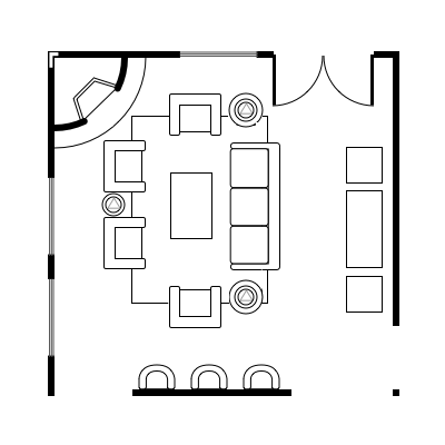
In this living room layout, we have once again created a passageway from the entrances on the bottom right to the French doors at the top. This layout is great if you want a range of seating options. The couch, the two chairs at its end, and the chairs opposite offer a nice mix of conversation zones: Intimate ones with the sofa chairs and more open ones on the couch in combination with the rest of the chairs.
(image from Pinterest)
11. The Peaceful Host
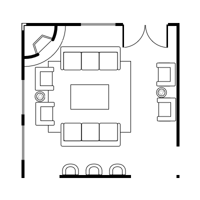
In the last two layout ideas for your square living room, we replaced our chest and side chair arrangement on the right side with different pieces of furniture. So if you’re not convinced by this idea, you definitely have other options.
We now have two chairs and a floor lamp on the right wall. However, you should still counterbalance the big fireplace. In this layout, hanging artwork above the chairs does the trick.
Overall, the room is very balanced. The sofa is mirrored by another sofa, the chairs by more chairs. This creates a very calm and peaceful setting. It’s the perfect setup if you like to entertain bigger groups in your living room as there’s plenty of seating space available.
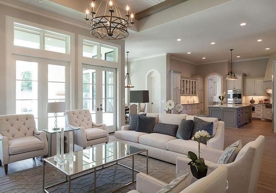
(image from Pinterest)
12. The Entertainment Star
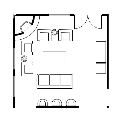
In the last of our furniture arrangement layout ideas for your square living room, we have another element counterbalancing the fireplace: An entertainment unit or a chest with a TV, with a side chair next to it. It not only serves as a counterbalance but also as a second focal point.
Directly opposite, there are two sofa chairs – perfect for catching up on the latest TV show! If you want to stretch out, you can always make use of the 3-seater sofa. Two more sofa chairs and a floor lamp balance the sofa.
So, if you want to incorporate a TV or entertainment unit – especially a big one – this could be a great setup for you.
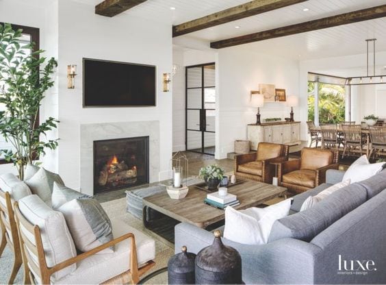
(image from luxe.)
Here we go, these were our 12 layout ideas for your square living room. How did we do? Which living room layout do you like best?
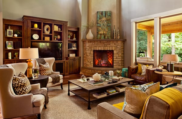
If you’re puzzling your head over another difficult room layout, remember: the most important thing is to create balance. You already know how to create visual balance through counterbalancing large features in your room. But there’s another trick: Use the same color or pattern in different elements and move it across the room. Have a look at the picture below: the base color of this living room is white, but there are turquoise pillows, and the color also appears on a lamp, on a vase and on a picture in the background. In doing so, you can tie everything together and create a well-balanced and cozy living room.
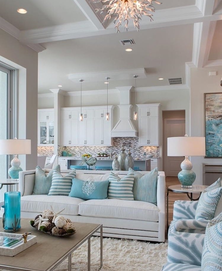
(image from Pinterest)
Have fun experimenting with your living room layout!
Check out Roomhints articles for more kitchen remodel ideas, the best bathroom vanity hints or if you are really bold, blue kitchen cabinets.