3 Modern Bathroom Ideas for Every Color Palette

Lane McNab Interiors redid this beautiful Berkeley home for a young, busy family who wanted their home to be elegant but livable. With three bathrooms in the home, there was a huge opportunity to give each room its own personality and ambiance. Keep reading to see these 3 beautifully modern bathroom ideas!
Modern Bathroom Hint #1: Light and airy
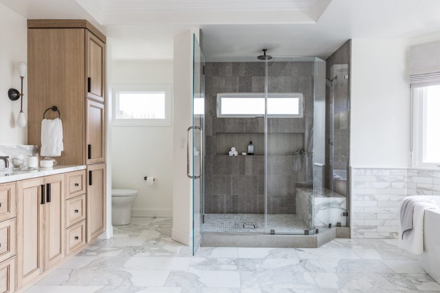
For the master bath, we went with a light, airy color palette, which was perfect for this huge space with tons of natural light flowing through it. The marble floors and backsplash really shine in this space because of all the light.
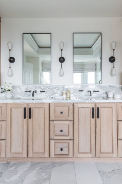
In a large space like this, we went for a larger vanity that provides plenty of storage. The light wood pairs nicely with the marble countertops. Protip: going with a vanity that looks like furniture in the master bath really helps to make the master bath feel like an extension of the master bedroom! This design-orchestrated flow between the bedroom and bathroom really makes a space feel comforting and inviting.
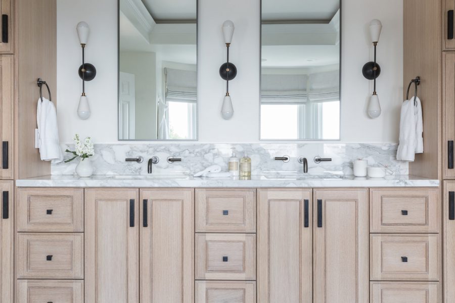
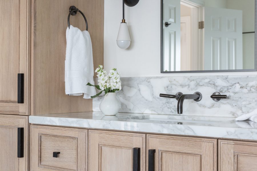
The sconces and their round silhouette punctuate the clean linear lines of the mirrors nicely. Because the vanity is so large, and there is quite a bit going on with the double vanity and all of the cabinetry, we kept the hardware subtle and very understated. The minimal design of the sink faucets help this area look clean and not too busy — they almost blend away and out of sight!
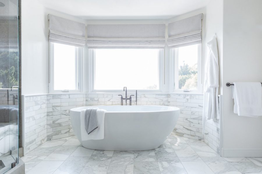
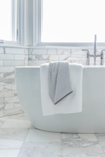
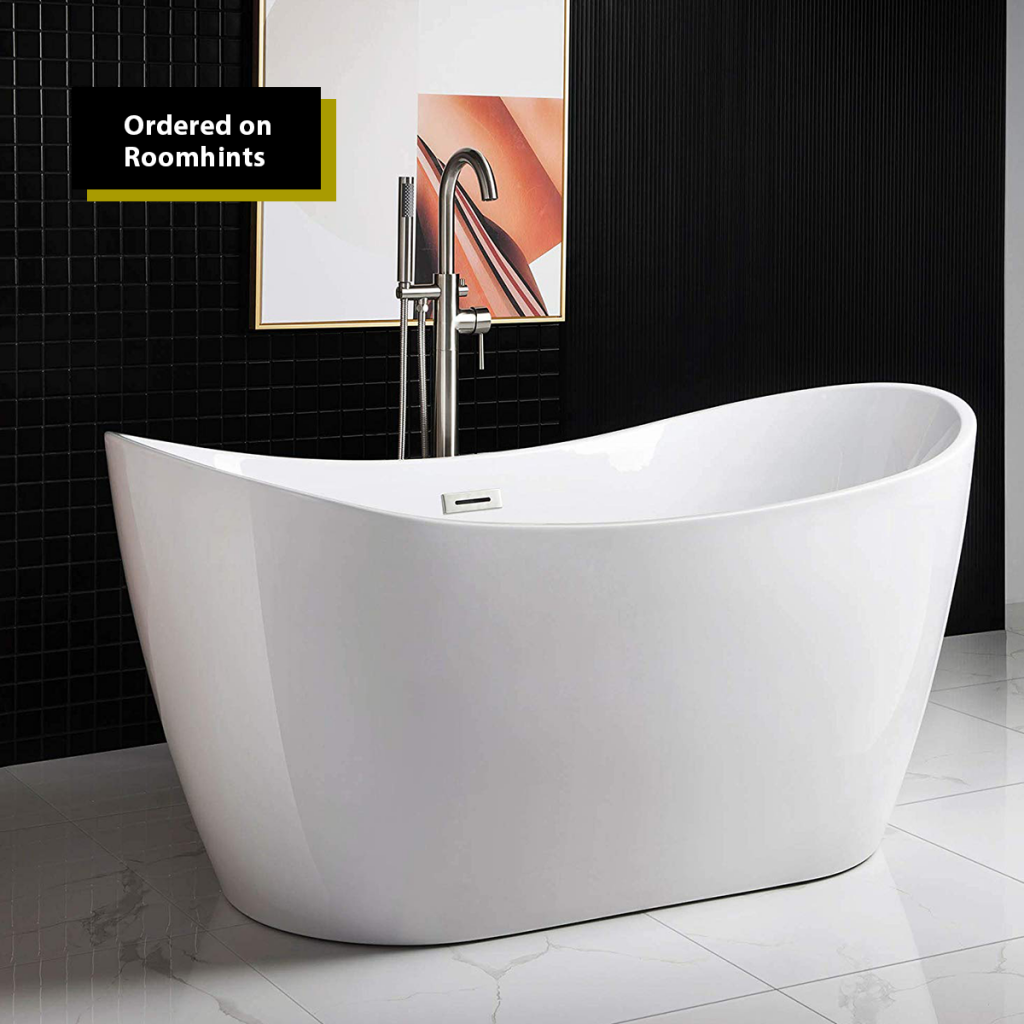
This nook in the room was the perfect opportunity for a tub. The free-standing tub is truly the epitome of eloquence and sophistication. It creates a focal point in the room, especially with the windows that envelope the tub.
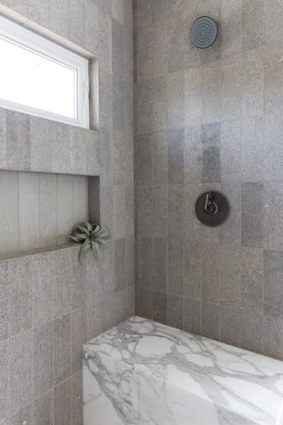
We went with a darker shower to provide some contrast in this very light room. The gray backsplash really helps to bring out the marbling in the white marble tile. The marble continues into this shower bench, which was the perfect use of an awkwardly-shaped shower.
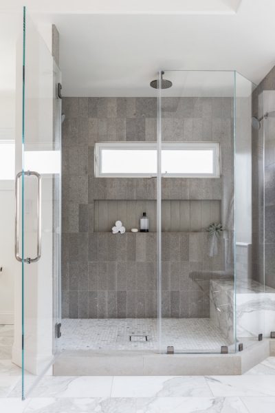
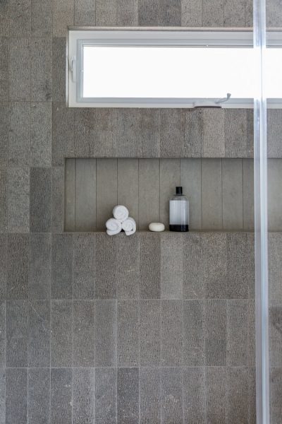
The hardware is again very minimal (although there are two showers and one rain shower — how luxurious!), and the glass shower door really opens up the room. We added in this recessed shower niche, which is not only very functional, but adds a different design element and breaks up the dark backsplash nicely.
With so many great design pieces in the bath, from the vanity to the tub to the shower, we decided to keep the water closet hidden in the corner as to not distract from the more beautiful pieces in the room. In a master bath, where the space is usually larger and which is usually connected to a bedroom, it’s great to keep the water closet out of sight when possible.
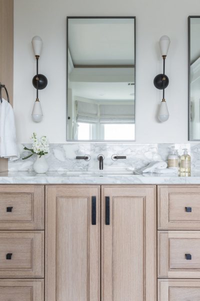
The trick with designing a bathroom that feels as beautiful and flows as nicely as the one above is to use a simple neutral color scheme. Make sure your mirrors match to the hardware on your cabinets, lights, and faucets.
All the tile we purchased from La Maison Nicolas was so beautiful and made the bathroom elegant yet grounded. It also balanced the wood cabinetry and dark bronze hardware. I love their Calacatta marble tile and paired with the shower tile, the mix of elements keep the space grounded and add depth. The only downside with marble in general is that it’s so porous, so I wouldn’t use it in a high traffic area or a kids’ bath. For this master bath however, it’s the perfect application.
Hint #2: Dark and cozy
For this bathroom remodel, we went for a darker palette to create a cozy ambiance. A lot of people are hesitant to create dark bathrooms in smaller spaces, but it can actually be quite comforting and serene!
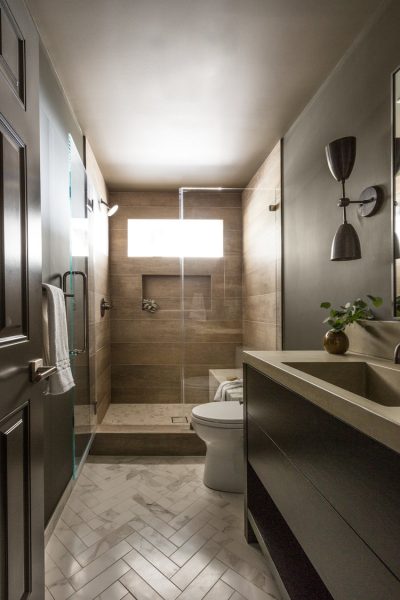
We went with the same sconces that are in the master bath except in a darker shade. The key to designing smaller bathrooms, especially when you want to use a darker color palette, is to make sure that everything is scaled nicely. A larger light fixture might have overpowered this room, so we went with a minimal one.
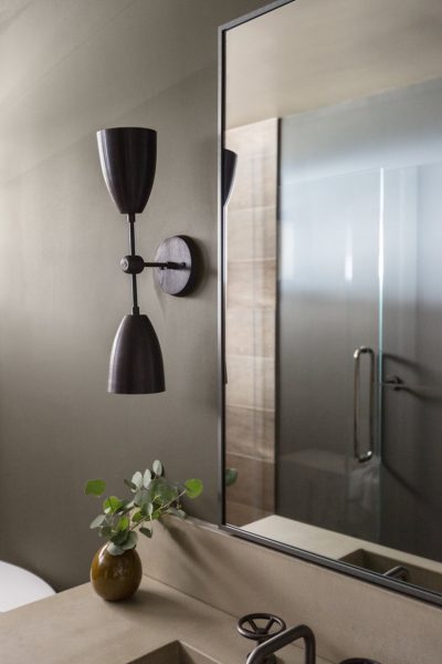
Natural light is important, and luckily we had this decent-sized window in this bathroom to let some light in. We went with a glass shower door as to not obstruct the light from this window.
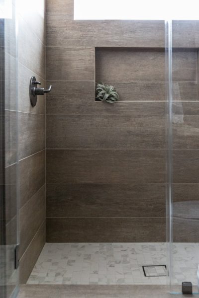
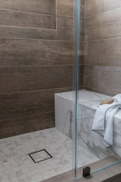
We went with a marble herringbone tile that breaks up the dark space nicely. Protip: When designing a darker space, make sure you have at least one design element that provides a light contrast! We also think the marble floor (which also continues into the shower bench) really helps to connect the two baths and provide a sense of continuity.
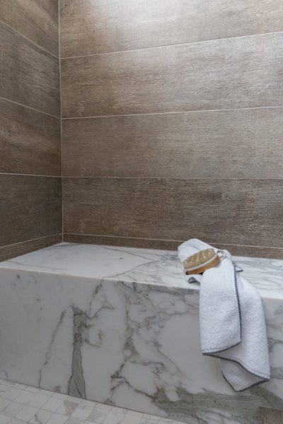
There is also minimal hardware and a recessed shower niche (we love shower niches!). We went with a dark shower backsplash again, but this time it runs horizontally, which emphasizes the width of this small space instead of its height, making it feel larger. Notice the shower drain insert — it blends in with the rest of the tile and makes the shower look more sophisticated.
Hint #3: Pop of color
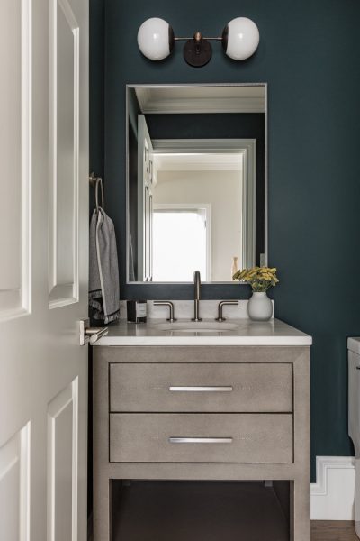
For this bathroom, we went with a pop of color in this dark turquoise wall, which makes the space feel warm, fun, and family-friendly. We kept this main floor powder room very simple and classic, from the wood floor to the simple vanity. When we think of a universally modern, family-friendly bath, this is what we think of! A small powder room like this modern bathroom that exudes functionality, and the no-fuss design of this room really does that.
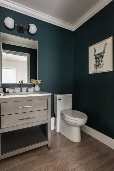
The clean, linear lines of the vanity and the mirror really helps to ground the space and create the perfect modern bathroom.
What did you think of these 3 modern bathroom ideas? For more information, visit lanemcnab.com.
For more bathroom ideas check out our bathroom remodel guide, hints every small bathroom needs or freestanding tub vs. built in tub?

