
8 Hints to use marble countertops in your bathroom and kitchen with Designer Gina Holz!
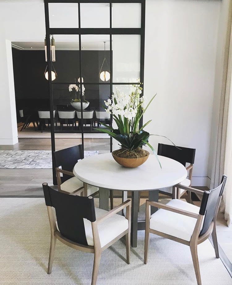
Hint #1: Use a simple Color Palatte
Gina Holz: “For this project, we stuck to a very simple palette. We chose a few colors and materials and repeated them in every room. Such as white and black marble countertops, grays and brass accents. This creates a very cohesive and soothing feel, throughout the house. The eye doesn’t jump around as much when colors don’t compete with each other.”
Gina: “We used concrete, steel, brick, marble, white oak, brass and glass for our material selections. We used these on the inside as well as the outside of the house.”
“The overall theme was “industrial glam” which bridged the gap between the husband and wife, who live here with their 4 children. ”
Hint #2: Use large grey tiles to create a concrete look
Gina: “For the pool bath below, we used large pieces of gray tile that look like concrete. Large pieces make the space look bigger and and have a warmer feel. We covered the entire shower and the room’s walls to create a large, open feeling.”
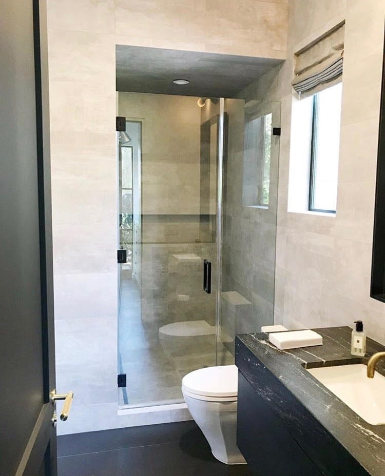
HINT #3: Use black floors to ground the space
Gina: “The black floor tile grounds the space while the black cabinet and bathroom marble countertops lead the eye up the wall, to the pop of brass shown in our faucet. The plumbing fixtures are California faucets and the door levers are from Buster and Punch.”
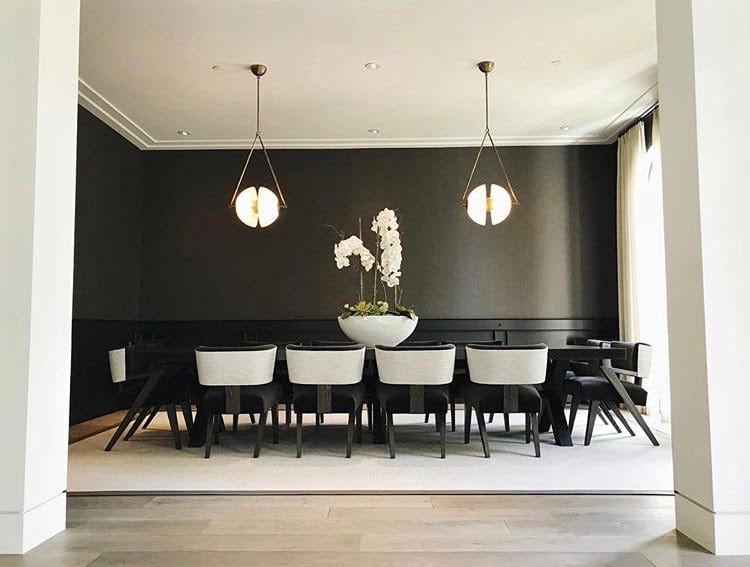
Hint #4: Use a drastic mix of dark and light to create a powerful, modern vibe.
Gina: “We offset the seriousness of the color palette with these 2 whimsical light fixtures from Apparatus Studio.”
Gina: “For the formal dining room, we wanted to play on the mix of masculine and feminine in the home. We lined the room in a cool, steel wainscoting and topped it with black linen wallpaper by Tri-kes, to warm up the look. The custom steel table is by Big Daddy’s Antiques and ties in the steel French doors in the room by Euroline. The custom Z chairs are by Coryne Lovick. A dark velvet by Steven Harsey was used on the front panels and seat of the chair, while the back panel was covered in a shimmery linen by Zinc.”
Gina: “The shimmery linen fabric added a touch of glamour to the space. The wool rug bound in leather grounded the space against the dark walls and table. The linen sheers are made with fabric by Steven Harsey and softened the overall look of the room.”
Hint #5: Wool is a great material for rugs. They are durable and easy to clean.
Hint #6: Make everything two toned to create a cohesive vibe in the room as well as the adjacent room.
Gina: “For the living room, Euroline provided us with steel pocket doors that created an elegant, architectural element in the space. The chairs are by Joseph Jeup and the two toned table was custom made for the home.”
Gina: “We used the same rug and draperies in both the living room and dining room to make the open floor plan feel more connected and separated the two spaces with a hide runner by The Rug Warehouse. The hallway light fixtures are by Apparatus.”

Hint #7: To pick our your marble countertops – always go down to the marble yard and select the exact marble slabs you want to purchase. These are natural materials and can vary quite a bit in veining, color and size. I like to take samples with me and make sure the slabs work with the rest of my materials.
Gina: “This kitchen personifies our industrial glam theme for the home. Again, we have our two toned, black and white with brass vibe going on in here. We used concrete pendants over the island to add an element of surprise and still stay committed to our color scheme. The brick lined walls in the breakfast room create the feeling of a separate space and also brings the outside in. The exterior of the home is lined with the same brick material.”
Gina: “Our brass faucets are California Faucets and the cabinet hardware is Buster and Punch, which has an industrial feel to them. The light fixture over the breakfast table is Lindsey Adelman. The oak bar stools are by Horne. We used book matched Calcutta marble as the backsplash and marble countertops. This created a warm, organic juxtaposition against the cool, linear brick walls.”
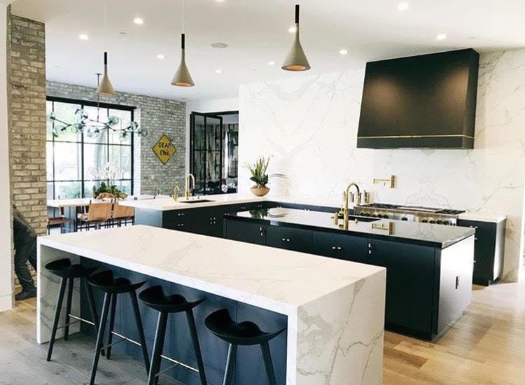
Hint #8: When using a natural material like marble in your kitchen, try to create a workspace that has a more practical surface on it.
Gina: “Here we decided that the center island would be the prep area for cooking. We used a black marble countertop here to break up the space visually and also to provide a more forgiving surface to prepare food on. The hood was custom made by Gina Holz Designs, Inc. We created a visual separation between the kitchen and the eating island, by using the waterfall edge detail. This separates it from the working part of the kitchen and feels more special for guests.”